6.1: Final Poster
- Matt Law
- Oct 17, 2018
- 1 min read

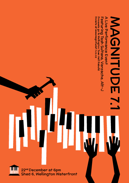
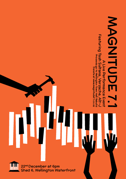
Above is our final poster. This poster was derived and tweaked from several previous developments. What we really like with this composition, is the fact that the text doesn't take away or overcrowd the rhetoric of the visual. To ensure this happened, I placed the majority of text to the right of the page and flipped it 90degrees. This technique adds a new experience when viewing the poster, as well as drawing the reader vertically down to the visual of the piano keys. This poster also features our logo which was decided to be the Town Hall silhouette with piano keys in place of the building's columns.

Left: The viewer's eye path in which we hope the composition of all the elements visualizes and portrays.
We sent this poster off to Toystore on Sunday night to make the Monday 9 am cut-off. On Monday we were able to show Klaus our poster despite knowing it couldn't really be changed with it having already been sent off. During this talk, Klauss mentioned the idea to flip the Magnitude 7.1 text 180degrees. Following this idea would allow the viewer to read top right and down however we feel that the variation we chose to send off worked better as the reader starts from the left and travels through the visual rhetoric to the title, body-text and details of our event. Below are two variations of this text layout.


Comments