- Flynn Beeman

- Oct 19, 2018
- 3 min read
Updated: Oct 21, 2018
Please note there is a glitch in the published desktop XD version with the width of the town hall and community pages. Refer to XD file to view correctly.
After looking through the recordings i believe if i were to change anything i believe i would remove the spikes from the mobile version and fix the font issues on the event page on the mobile as well.
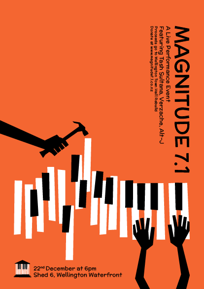
We have conceptualised a live performance music event called 'Magnitude 7.1'. Our goal for the event is to bring the Wellington community together in support of the earthquake strengthening of the town hall.
We have planned our animation or poster will be our first touch points. Seen as part of promotion on social media or pasted across Wellington city. From there people can connect to the website in which people can find out more, donate, share, sign up, etc.
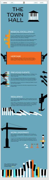
Our event's is aim to encourage a 'coming together' through music. Our work has been heavily inspired by early eastern European design. This can be seen through the use of rough-cut edges in elements such as the instruments, tools, buildings and more. Following a torn-back style and colour palette enable us to present easily-legible narratives that all the while are compelling and engaging.
Our narrative looks at viewing this event has a positive, synchronized event that can help quite literally rebuild the Town Hall through the donations raised by attendees.
We have looked to integrate our marketing knowledge into this assignment. Our approach has been to give our event identity. Repeating color scheme and style throughout all our touchpoints forms consistency and encourages brand awareness, associations and recall. Our distinct visual elements could easily be used for future events.
Our title Magnitude 7.1 is the exact richter scale of the September 2010 earthquake that damaged the town hall. The title is a remembrance of the devastation that the earthquake caused but is also a reminder that this devastating disaster is something we can grow from as a community.
7.1 conveniently is also surround sound. It is the common name for an eight-channel surround audio system commonly used in home theatre configurations.
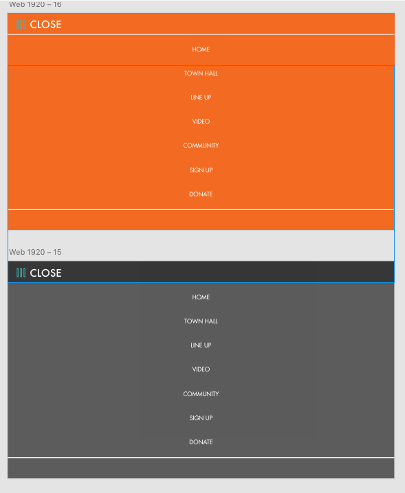
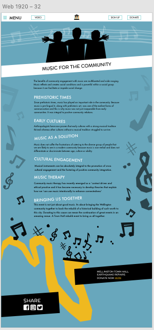
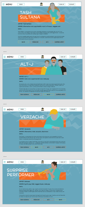
‘Magnitude 7.1′ is a free event dedicated to the people of Wellington. It is designed to be an escape from the everyday, having a range of easy going music. The website has integrated the nature of this, exploring the power music has on communities and town hall information. The website has a means to stay connected, share and help donate to the cause. The function and aesthetic have been kept lively, simple and fun for ease of use interest. Visual flare through the website creates points of difference and interest from the audience. Bold brighter colours have been used to contrast the dulled nature of the orange blue backgrounds to create excitement and attract attention.
If i were to code this website things that would have been included are:
Video file would be included
Poster link would automatically download to users device
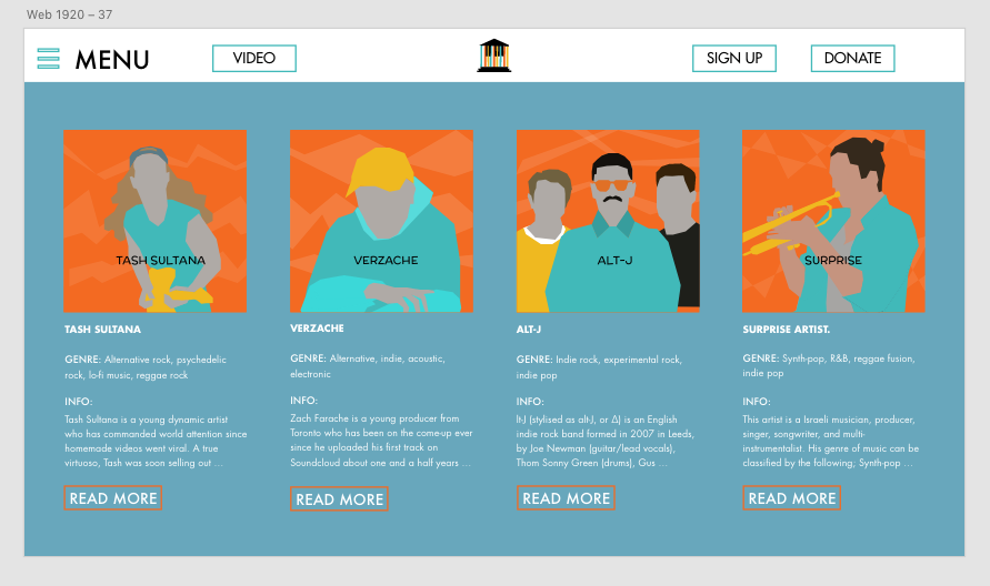
There would be left and right swiping options in the mobile line up page to flick through performers
There would be animated/ hover button clicks
Navigation could come down via mouse height
Some elements could have moved for visual interest and to connect to earthquakes and sound more
Sharing links would connect to social media accounts
Donation page would function to some extent yet obviously there are security issues and other coding issues around online transfers of money
Sign up page would function
Below is screen recordings following me through both versions of the website i have made.