3.1: Artist Model - Saul Bass
- Matt Law
- Sep 25, 2018
- 1 min read
Updated: Oct 16, 2018
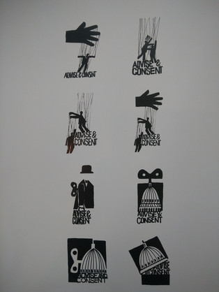
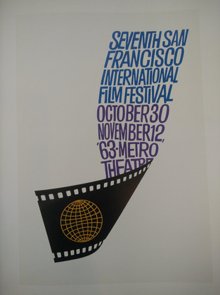
Bass has a very distinctive minimal style. He introduced his signature “kinetic type” which is one part of his design style I really like. The look hand-cut and merge well with the surrounding visual elements. In terms of other visual elements, I really like the loosely-cut blocks that fill up the negative space. They make the designs seem like a jigsaw or a game. His use of white and then two popping colours also works well.
Library Research taken from the book 'Saul Bass, A Life in Film & Design' by Jennifer Bass & Pat Kirkham. Iiked reading this book and understanding the iterations and design choices taken by Bass. His designs are torn back and colour isn't always the biggest visual element. Instead he uses colour to only draw attention to areas of interest and interaction. What is most important, is the actual rhetoric and shapes I find.


Comments